New Horizons is giving Earth the A-OK! All the systems look good and we are only 37.4 million kilometres away from Pluto. Yes that is far, but considering we usually see Pluto at a distance 200 times that, we are doing pretty well. The newest processed photos have come in from NASA and John’s Hopkins University, and they are starting to show a complex and mysterious surface chock-full of science goodies that make astronomers salivate like Pavlov’s dog when the bell rang. But image processing is a science in itself, and I wanted to show you the difference between a raw photo of Pluto and one that is the result of complex statistical techniques. Let’s start with the good stuff.

Yes there is a video too! Showing the rotation of Pluto and Charon’s orbit.
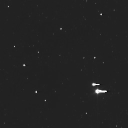
To clean the images to look this awesome, mission scientists use a technique called deconvolution, where they try to remove parts of the image that they don’t want, leaving increased focus on the features we are looking for. In the deconvoluted images above, we can see some interesting dark and light spots, but we have to be careful because deconvolution can show features that aren’t actually there. Here are some of the raw, unprocessed, non-zoomed images.


The cleaned up images definitely look better, but this is a good contrast for how much work goes into bringing the best out of photos. The rest of the raw images can be found here for those interested.
Just like with my Ceres post a couple of days ago, when we do receive high resolution images of Pluto, we can look back on these pictures and see the progression of the spacecraft as it travelled quickly through the empty darkness of the solar system, and how humanity touched the enigmatic former 9th planet.
