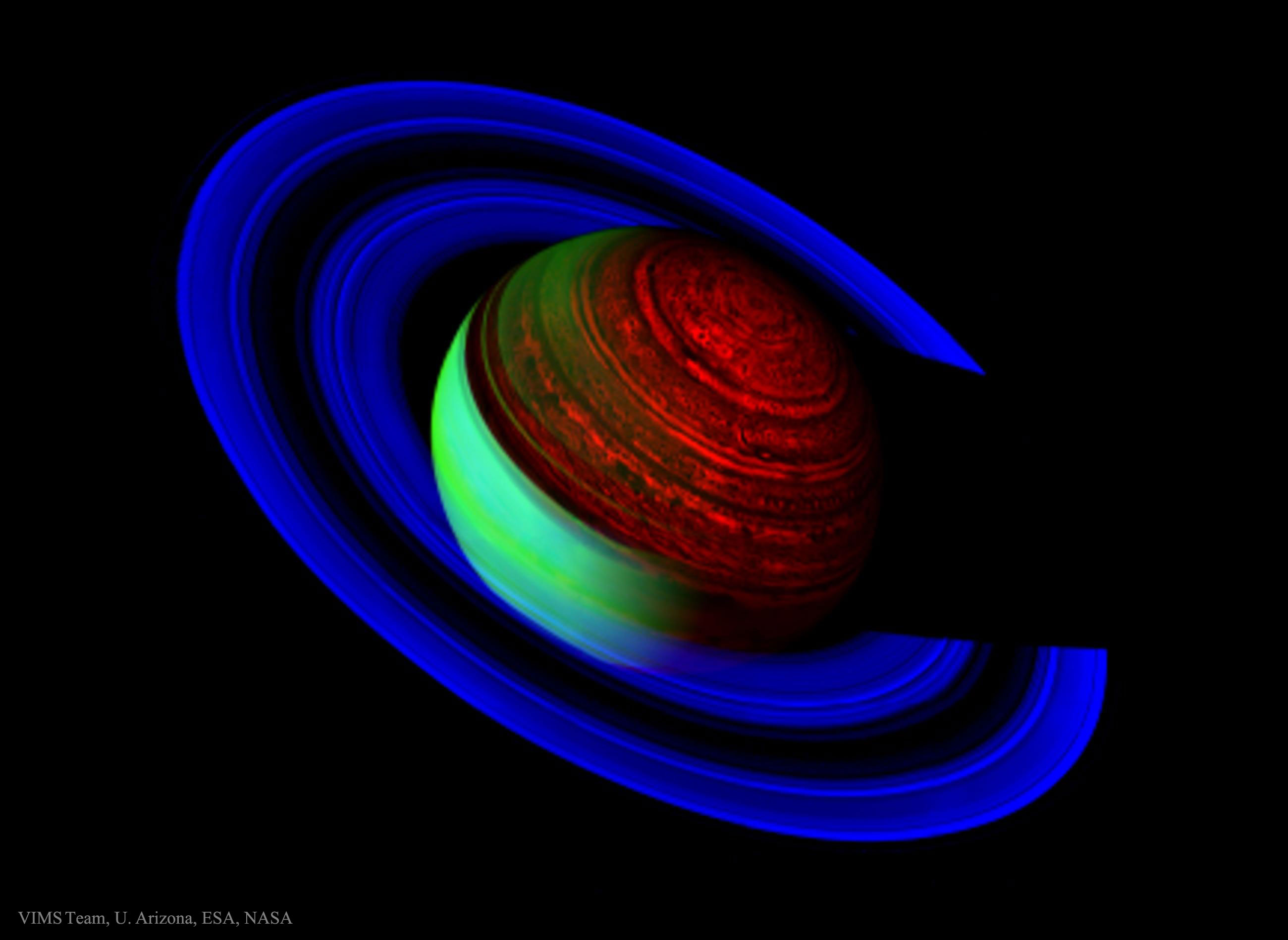
I love false-colour images. They reveal detail that you can’t see in real life, but they also highlight things in an artistic way. For me it’s an excellent marriage of art and science, and as a communicator it helps me get concepts across in an accessible way. So when I saw the APOD image of Saturn from earlier this week, I had to discuss it.

Saturn never has looked this way, and it never will. The colours are vivid and unrealistic, but they show the differences in three distinct but close wavelengths of light on the electromagnetic spectrum. All of the light is in the infrared part of the spectrum. The blue shows the wavelengths of light that represent sunlight reflected by Saturn’s rings. The green represents the sunlight reflected by Saturn’s atmosphere. The red shows the internal glow from Saturn’s convective heat engine, revealing detailed cloud layers, massive hurricanes the size of Earth, and a strange hexagonal feature at the north pole.
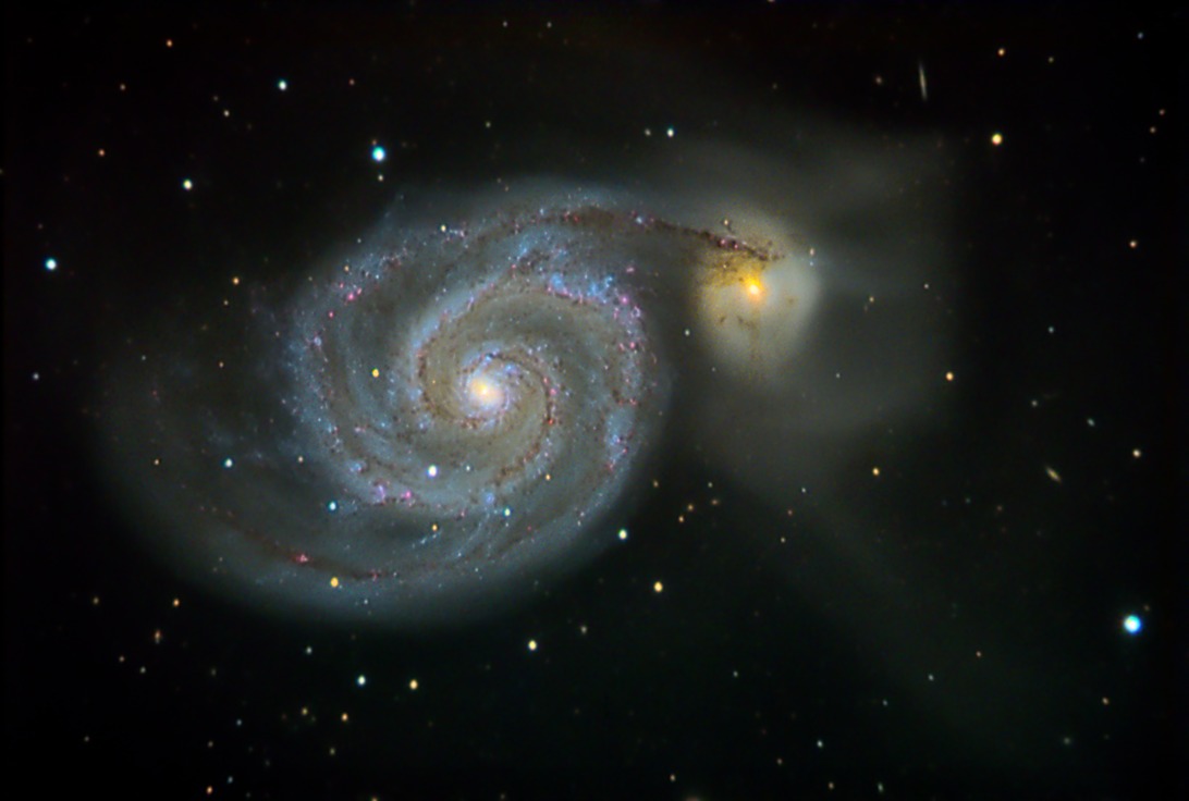
Astronomers and image processors use the RGB format to colour images of galaxies or nebulae. The colours aren’t vivid in those objects either, but knowing that a particular filter has a particular colour can help make a realistic representation of an object’s colour that human eyes can see. For example, the F502N filter on Hubble is a narrowband filter that let’s through light at 502 nm, which is green in the electromagnetic spectrum. The image is generally released in greyscale by Hubble, but if you colour it and add it to a similar image that used a filter in the red part of the spectrum, and add a third for the blue part, you can end up with a gorgeous image, like this one.

Now I should mention that the above picture uses three filters that are not all in the visible part of the spectrum. In fact it uses the red from an infrared filter, the green from visible light, and the blue from ultraviolet. So even though the image is false coloured, it shows the major features of the galaxy in a representative way.
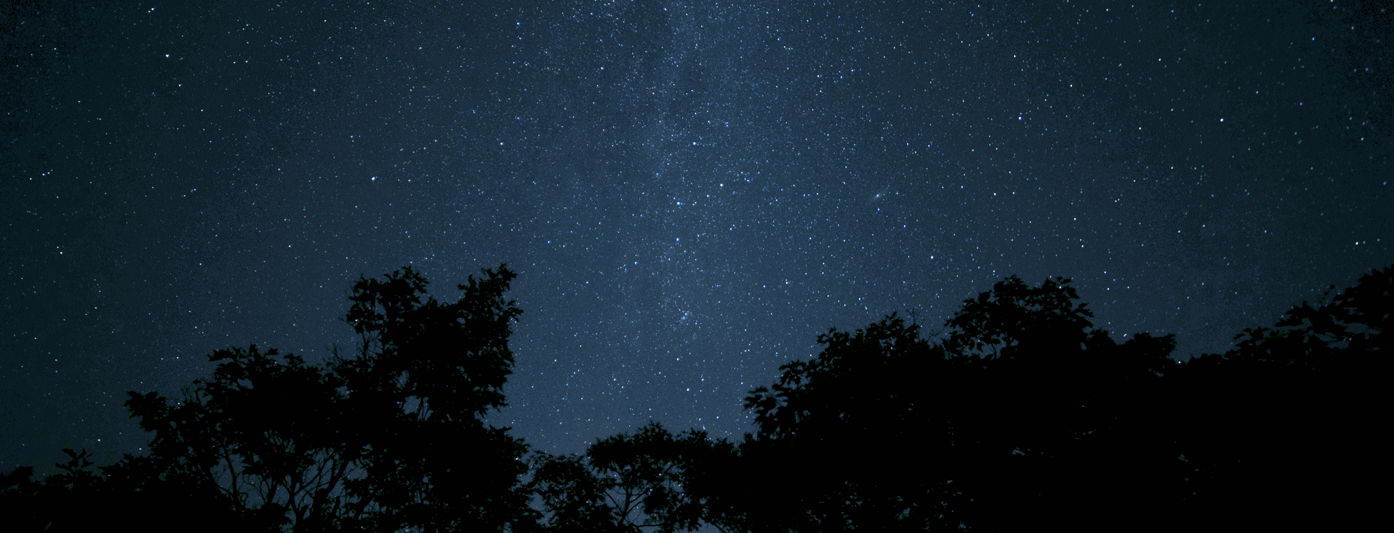
If you were to see real galaxy, without the false colouring, this is what you would see.

It’s beautiful, but it’s nothing like the gorgeous pictures we see that reveal the detail in the spiral arms. With a real galaxy seen through human eyes, the central brightness of the galaxy’s core outshines everything else by far. Especially since it contains Billions of stars in a concentrated space.
Sometimes the enhanced photos are better than the real ones. as least that’s what magazines will tell you.
